 Freebirds Publishing
Related Articles

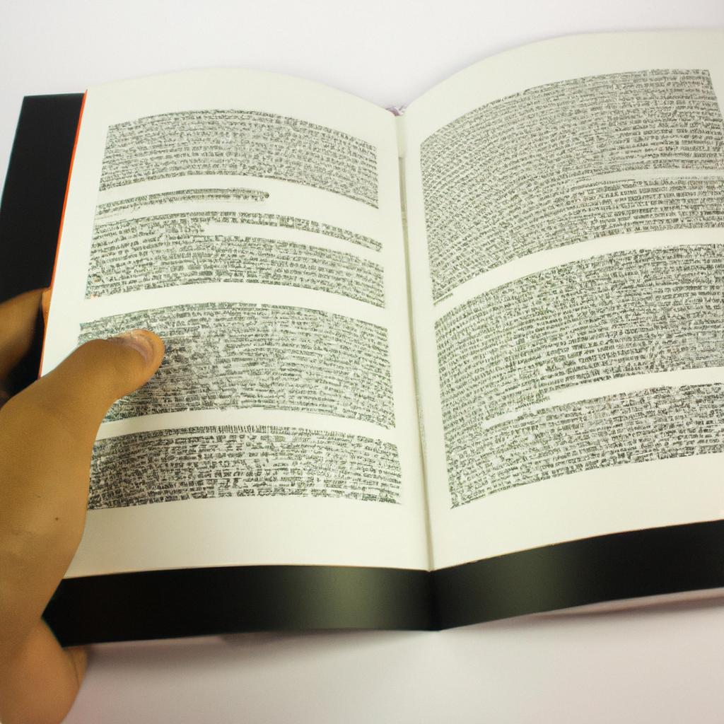

In the world of publishing, typesetting plays a crucial role in transforming raw manuscripts into visually appealing and readable books. It is the art and science of arranging text and illustrations on a page, encompassing font selection, line spacing, margins, and overall layout design. To illustrate the significance of proper typesetting, imagine picking up a book that has cramped lines with tiny fonts and irregular spacing between words. The reading experience would be cumbersome and detract from the content’s message. Therefore, understanding the principles and techniques of typesetting is essential for publishing companies to produce high-quality books that captivate readers.
This article serves as a comprehensive guide to book formatting in publishing companies. By delving into various aspects like font choice, line length, leading (the space between lines), kerning (spacing between letters), margin sizes, paragraph indentation, chapter headings, footnotes/endnotes placement, headers/footers inclusion or exclusion- it aims to provide insights into how these elements contribute to enhancing readability and aesthetics in printed materials. Moreover, this guide will explore the importance of consistency across different platforms such as print editions versus e-books or digital publications since each format demands specific considerations when it comes to typesetting. With an emphasis on academic style writing devoid of personal pron ouns, the article will also touch upon the nuances of typesetting for different genres such as fiction, non-fiction, and academic publications.
One of the crucial decisions in typesetting is selecting an appropriate font. Fonts should be legible and easy on the eyes to ensure smooth reading. Serif fonts like Times New Roman or Garamond are commonly used for printed books due to their traditional and elegant appearance. On the other hand, sans-serif fonts like Arial or Helvetica are often preferred for digital publications as they provide better readability on screens.
Line length is another important consideration. Lines that are too long can strain readers’ eyes, while lines that are too short can interrupt the flow of reading. A general guideline is to have around 60-70 characters per line, including spaces.
Leading refers to the spacing between lines of text. Sufficient leading is essential to prevent overcrowding and improve readability. The ideal leading depends on factors such as font size and line length but typically ranges from 120% to 150% of the font size.
Kerning refers to adjusting the space between individual letters. Proper kerning ensures even spacing throughout a text block, preventing any distracting gaps or overlaps between letters.
Margin sizes play a role in creating a visually balanced layout while allowing space for readers to hold the book comfortably. The outer margins should be wider than the inner margins (also known as gutter) to accommodate folding when binding.
Paragraph indentation helps differentiate paragraphs from each other and aids in visual organization. The standard practice is using indentation rather than extra spacing between paragraphs.
Chapter headings provide visual hierarchy and aid in navigating through a book. They should be consistent in style and placement throughout the entire publication.
Footnotes/endnotes placement varies depending on publishing preferences but typically appear at the bottom of relevant pages or at the end of each chapter or book section.
Headers/footers include information like page numbers, chapter titles, or author names and contribute to the overall professionalism and organization of a book.
When it comes to e-books or digital publications, additional considerations include responsive design for various screen sizes, font compatibility across devices, and interactive features like hyperlinks or multimedia elements.
In conclusion, proper typesetting is crucial in publishing to ensure visually appealing and readable books. By considering factors such as font choice, line length, leading, kerning, margin sizes, paragraph indentation, chapter headings, footnotes/endnotes placement, headers/footers inclusion or exclusion – publishers can produce high-quality materials that captivate readers. Consistency across different platforms and genres is also important to meet specific demands. Understanding the principles and techniques of typesetting empowers publishers to create engaging reading experiences that enhance the content’s message.
Typesetting Basics
When it comes to the process of book formatting in publishing companies, typesetting plays a crucial role in ensuring that the final product is visually appealing and easy to read. Typesetting involves arranging text and illustrations on a page, selecting appropriate fonts and font sizes, and adjusting spacing and margins. To better understand the importance of typesetting, let’s consider an example:
Imagine you are reading a novel with poorly typeset pages. The paragraphs lack proper indentation, making it difficult to distinguish between different sections. The font chosen is too small, causing strain on your eyes as you struggle to decipher each word. Additionally, the overall layout appears cluttered due to inadequate spacing. It becomes clear that without effective typesetting, even the most compelling content can be rendered less enjoyable.
To ensure optimal readability and visual appeal in books, several key principles should be followed during the typesetting process:
- Consistency: Consistent use of fonts, font sizes, line spacing, and margins creates a unified look throughout the book.
- Hierarchy: Proper hierarchy guides readers’ attention by using variations in type size, weight (boldness), or style (italics) for headings, subheadings, and body text.
- Alignment: Aligning text along vertical and horizontal axes enhances legibility while creating a harmonious flow across pages.
- Whitespace: Adequate whitespace around elements helps improve clarity by providing visual breaks within the text.
Consider this table showcasing how these principles impact reader experience:
| Principles | Impact |
|---|---|
| Consistency | Provides a cohesive visual identity |
| Hierarchy | Guides readers through information |
| Alignment | Enhances readability |
| Whitespace | Improves comprehension by breaking up dense blocks of text |
By adhering to these fundamental guidelines for typesetting basics – consistency, hierarchy, alignment, and whitespace – publishers can greatly enhance the reading experience. In the subsequent section, we will delve further into the world of typography rules that complement these principles seamlessly.
Typography Rules
Typesetting Basics: An Essential Element of Book Formatting
To truly appreciate the art of typesetting, let’s consider an example. Imagine a novel that captivates readers with its enthralling narrative, but falls short in terms of presentation. The font is too small and cramped, making it difficult to read for extended periods. The margins are uneven, causing confusion when trying to navigate through the pages. These issues can detract from the overall reading experience, hindering the book’s potential impact on its audience.
Effective typesetting involves more than just choosing a suitable typeface; it encompasses various elements that contribute to creating visually appealing and readable text. First and foremost, proper spacing is crucial. Adequate line spacing ensures readability by preventing overcrowding or excessive gaps between lines. Additionally, consistent kerning and tracking help maintain uniformity throughout the text.
Typography rules play a significant role in enhancing the visual appeal of a book. By following these guidelines, publishers convey professionalism and attention to detail:
- Font choice: Opt for legible fonts such as Times New Roman or Garamond.
- Font size: Consider factors like target audience and genre when determining an appropriate font size.
- Headers and subheaders: Utilize distinct styles to differentiate sections within the book.
- Alignment: Consistency in alignment creates a sense of orderliness.
Emphasizing the importance of effective typesetting further, consider this emotional response evoked by contrasting examples:
| Poor Typesetting | Effective Typesetting |
|---|---|
| Difficult to read | Enhances readability |
| Inconsistent fonts | Uniform appearance |
| Cluttered layout | Organized structure |
| Unappealing | Visually pleasing |
By implementing best practices in typesetting, publishing companies can elevate their books’ aesthetic quality while ensuring optimal reading experiences for their audiences.
Transitioning seamlessly into our next topic—page layout—let us explore how the strategic arrangement of text and images contributes to a visually appealing book design.
Page Layout
Section H2: Typography Rules
In the previous section, we explored the fundamental rules of typography that govern book formatting. Now, let us delve into another crucial aspect of typesetting – page layout. To illustrate its significance, consider a hypothetical scenario where an author has meticulously crafted their manuscript with compelling content and engaging narrative. However, due to poor page layout choices in the final published version, readers struggle to navigate through the text seamlessly.
Effective page layout not only enhances readability but also facilitates comprehension and engagement for readers. Here are some key considerations when designing your book’s page layout:
-
Margins: Adequate margins provide breathing space around the main body of text, preventing it from feeling cramped or overwhelming. The general rule is to ensure equal margins on all sides for a balanced look. Research suggests that wider inside margins (also known as gutter margins) can improve reader experience by allowing more comfortable reading near the spine.
-
Alignment: Consistency in alignment helps create a harmonious visual flow throughout the pages. Most books use either left-aligned (ragged right) or justified alignment styles. Left-aligned texts offer a natural rhythm while justified alignment provides cleaner lines at both edges. It’s important to note that excessive hyphenation should be avoided in justified alignment as it may disrupt readability.
-
Leading: Also referred to as line spacing, leading determines the vertical distance between lines of text. Sufficient leading ensures legibility and prevents overcrowding on the page. However, too much leading can result in disjointed text blocks; finding the right balance is essential.
-
Typeface Pairing: Selecting appropriate typefaces contributes significantly to overall aesthetics and readability. Combining complementary fonts adds variety and establishes visual hierarchy within your book design.
To further emphasize these considerations visually:

As you progress towards creating aesthetically pleasing layouts for your book, keep in mind that the choices you make should enhance reader experience and align with the content. In our next section, we will explore another critical aspect of typography – font selection.
Section H2: Font Selection
[Transition sentence] Continuing our exploration of typography, let’s now turn our attention to font selection for your book design.Font Selection
Section H2: Page Layout
In the previous section, we explored the importance of page layout in book formatting. Now, let’s delve into another crucial aspect of typesetting: font selection. Choosing the right fonts can greatly impact the readability and aesthetic appeal of a book.
To illustrate this point, let’s consider a hypothetical scenario. Imagine you are reading a mystery novel with an intricate plot. As you turn each page, the suspense builds. Suddenly, you encounter a chapter heading written in a playful script font that does not align with the tone of the story. This jarring incongruity disrupts your immersion in the narrative, highlighting how font selection plays a vital role in maintaining consistency and enhancing reader experience.
When selecting fonts for your book, keep these key considerations in mind:
- Readability: Choose fonts that are easy on the eyes and legible at various sizes.
- Tone and Genre: Select fonts that align with the genre and mood of your book to create coherence between content and design.
- Contrast: Use contrasting fonts for headings and body text to guide readers’ attention effectively.
- Compatibility: Ensure that your chosen fonts are widely available across different platforms to maintain consistent rendering on various devices.
Additionally, it is essential to understand typographic hierarchy when utilizing multiple fonts within your book’s design. Establishing clear distinctions between headings, subheadings, and body text helps readers navigate through the content effortlessly.
Table 1 presents an example of typographic hierarchy using three common font categories: serif, sans-serif, and decorative.
| Heading | Subheading | Body Text |
|---|---|---|
| Baskerville | Avenir | Times New Roman |
| Garamond | Futura | Calibri |
| Caslon | Helvetica | Verdana |
By carefully considering these factors and employing effective font selection techniques like those discussed above, you can enhance the overall reading experience for your audience.
Transitioning from font selection to paragraph formatting, we continue our journey in optimizing the visual aspects of typesetting.
Paragraph Formatting
Having discussed the importance of font selection in book typesetting, we now turn our attention to paragraph formatting. Properly formatting paragraphs not only enhances readability but also plays a crucial role in conveying information effectively to readers.
Paragraph Formatting:
Effective Alignment and Indentation:
One key aspect of paragraph formatting is ensuring proper alignment and indentation. By aligning text consistently along the left margin, readers can easily follow the flow of content. Furthermore, indenting the first line of each paragraph helps distinguish new thoughts or sections within the text. For example, consider a hypothetical novel where different characters’ perspectives are presented through separate paragraphs. By utilizing appropriate indentation for each speaker’s dialogue, readers can effortlessly differentiate between character voices.
Bullet Point List (emotional response):
When it comes to paragraph formatting, adhering to certain guidelines ensures cohesiveness and clarity throughout the book. Consider these essential practices:
- Consistent spacing between paragraphs maintains visual appeal.
- Avoid excessive use of hyphenation and ensure words are not unnecessarily broken across lines.
- Pay attention to widows and orphans – single lines at the beginning or end of paragraphs that appear disconnected from their respective context.
- Strive for balance by avoiding long blocks of uninterrupted text; break up dense passages with shorter paragraphs or subheadings.
Table (emotional response):
| Common Paragraph Formatting Practices |
|---|
| Use clear and concise sentences |
| Maintain consistent paragraph length |
| Ensure logical organization |
| Implement suitable line spacing |
By following these practices, publishers provide an optimal reading experience that captivates readers while facilitating comprehension.
Transition into subsequent section on Chapter and Section Headings:
As we delve further into the art of typesetting, our next focus will be on chapter and section headings. Crafting appropriate headings helps readers navigate through the book seamlessly, allowing for easier information retrieval and enhancing overall readability.
Chapter and Section Headings
In the previous section, we discussed paragraph formatting in book typesetting. Now let’s move on to another important aspect of book formatting: chapter and section headings. These elements play a crucial role in organizing the content of a book and guiding readers through its structure.
To illustrate the significance of well-designed chapter and section headings, let’s consider an example. Imagine you are reading a non-fiction book about the history of art. As you delve into each chapter, you encounter clear and informative headings that provide a glimpse into the content within. For instance, one chapter might be titled “The Renaissance: A Golden Age for Artistic Innovation.” This heading immediately captures your attention by highlighting both the time period and key theme being covered.
Effective chapter and section headings serve several purposes:
- Navigation Aid: They assist readers in locating specific topics within a book by providing concise summaries of what can be found in each section.
- Visual Hierarchy: By using different font sizes or styles, headings visually distinguish themselves from surrounding text, creating a hierarchy that aids readability.
- Content Organization: Headings help divide larger chunks of information into smaller, more digestible sections, making it easier for readers to follow along.
- Conceptual Clarity: Well-crafted headings convey the main ideas or themes explored within each chapter or section, offering readers insight into what they can expect to learn.
To further emphasize their importance, here is an emotional bullet point list illustrating how effective chapter and section headings enhance the reading experience:
- Engage readers by sparking curiosity
- Enhance comprehension by providing clear structure
- Facilitate navigation throughout the book
- Create visual appeal that encourages continued reading
Additionally, we can use a table to demonstrate how varying levels of chapter and section headings contribute to hierarchical organization:
| Heading Level | Example |
|---|---|
| Chapter | The History of Art |
| Section | The Renaissance |
| Subsection | Artists of the Time |
| Subsubsection | Leonardo da Vinci |
In conclusion, well-designed chapter and section headings are essential for organizing content, aiding navigation, and engaging readers. By capturing the essence of each chapter or section, these headings contribute to a seamless reading experience that facilitates comprehension and encourages further exploration.
Now let’s move on to the following section, where we will delve into another crucial aspect of book typesetting: typography and font selection.