 Freebirds Publishing
Related Articles


Book formatting is a crucial aspect of publishing company success, as it plays a significant role in enhancing the readability and visual appeal of books. When readers open a book, they expect an organized layout that facilitates easy navigation and comprehension. Consider the case study of a hypothetical publishing company that experienced rapid growth after implementing effective book formatting strategies. By adhering to professional standards and incorporating essential tips for book formatting, this company not only enhanced the overall reading experience but also increased customer satisfaction and sales.
In today’s competitive publishing industry, achieving success requires more than just compelling content; it necessitates careful attention to every detail, including proper book formatting. This article aims to provide valuable insights into the essential tips for successful book formatting that can contribute to publishing company achievements. By exploring various aspects such as font selection, page layout design, headers and footers, paragraph indentation, margins, and spacing between lines and paragraphs, publishers can improve the aesthetic appeal of their books while ensuring optimal readability. Moreover, understanding how to format different elements like chapter headings, subheadings, quotations, and bullet points effectively will result in creating visually engaging publications that captivate readers’ attention from start to finish.
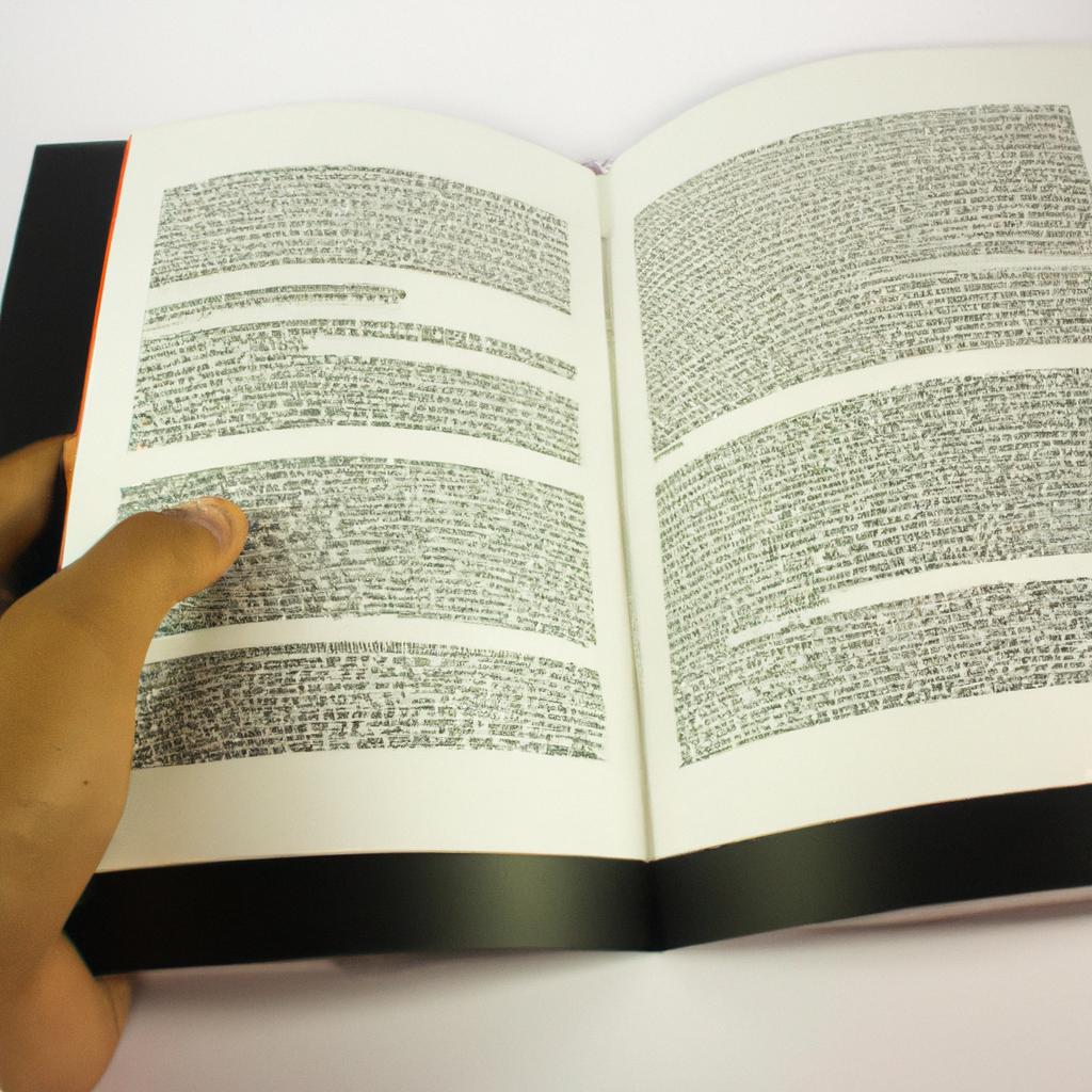
Typesetting: The art of arranging text on a page for optimal readability and aesthetic appeal
Typesetting: The Art of Arranging Text on a Page for Optimal Readability and Aesthetic Appeal
Imagine picking up a beautifully designed book that instantly captures your attention with its elegant typography, well-spaced paragraphs, and harmonious layout. This is the result of meticulous typesetting—a craft that goes beyond simply arranging text on a page. In this section, we will explore the importance of typesetting in achieving optimal readability and aesthetic appeal.
One key aspect of effective typesetting is ensuring proper line spacing. Adequate space between lines allows readers to navigate through the text effortlessly, preventing eye strain and promoting comprehension. For instance, consider an academic journal article crammed with dense text—each paragraph blending into the next without any visual breaks. Not only would it be challenging to read, but important information might also get lost amidst the sea of words. By contrast, appropriate line spacing enables readers to easily distinguish one paragraph from another, facilitating smoother reading experiences.
Furthermore, consistent kerning and tracking—the adjustments made to letter spacing within words and between characters—play a significant role in enhancing legibility. Poorly spaced letters can lead to confusion or misinterpretation of words. Think about how difficult it would be if all lowercase “l” letters were placed closer together; distinguishing them from uppercase “I” letters would become arduous. On the other hand, when kerning and tracking are carefully calibrated, they contribute to better word recognition and overall clarity.
To illustrate further how impactful typesetting can be, let’s consider four crucial elements:
- Font Choice: Different fonts convey distinct moods and evoke specific emotional responses in readers.
- Alignment: Proper alignment ensures coherence throughout the text while creating visual harmony.
- Indentation: Thoughtful indentation helps guide readers’ eyes along each new paragraph smoothly.
- Hyphenation: Skillful hyphenation prevents awkward line breaks by intelligently splitting long words across multiple lines.
This table summarizes the four elements mentioned above:
| Element | Description |
|---|---|
| Font Choice | The selection of a typeface that suits the content and desired atmosphere. |
| Alignment | Ensuring consistent alignment across the text, be it left, right, center, or justified. |
| Indentation | Utilizing appropriate indentation to visually separate paragraphs for improved readability. |
| Hyphenation | Employing hyphens strategically to prevent awkward line breaks within words. |
In conclusion, effective typesetting is an art form that combines technical precision with artistic sensibility. By proactively considering line spacing, kerning, tracking, font choice, alignment, indentation, and hyphenation in our publishing endeavors, we can deliver books that captivate readers from cover to cover.
Margins: Set Appropriate Margins to Ensure Sufficient White Space and Prevent Text from Appearing Too Close to the Edges
Moving on from typesetting techniques, another crucial aspect of book formatting lies in setting appropriate Margins. Margins serve multiple purposes beyond framing the page—they provide white space for ease of reading while preventing text from appearing cramped near the edges.
When designing a book layout, it is important to consider both aesthetics and functionality by establishing well-proportioned margins. Insufficient white space can make reading uncomfortable as lines appear squished together or even touch the page’s edge. On the other hand, excessively wide margins may result in inefficient use of space and lead readers’ eyes wandering aimlessly across vast expanses of blankness.
By maintaining balanced margins throughout a publication—whether it’s a novel or an academic manuscript—we create visual breathing room that enhances overall readability. These spaces allow readers to focus more easily on individual lines without distractions from adjacent text or graphics crowding their periphery.
In the following section about margins: set appropriate margins to ensure sufficient white space and prevent text from appearing too close to the edges, we will delve deeper into practical guidelines for determining optimal margins based on factors such as page size and content type.
Margins: Set appropriate margins to ensure sufficient white space and prevent text from appearing too close to the edges
Having discussed typesetting as a crucial aspect of book formatting, we now turn our attention to another vital element – margins. Properly set margins contribute significantly to the overall visual appeal and readability of a book. By establishing adequate white space around the text, they enhance legibility and prevent any undue clutter near the edges.
Margins play a critical role in ensuring that readers can comfortably engage with the content without feeling overwhelmed or distracted. For instance, imagine reading a novel where each line extends all the way to the edge of every page. Without proper margins, this would result in an unpleasant reading experience as your eyes struggle to navigate through tightly packed lines. In contrast, when there is sufficient margin space surrounding the text, it allows readers’ gaze to flow smoothly across pages, making it easier for them to focus on absorbing the author’s words.
To optimize your book’s formatting success, consider these essential tips regarding margins:
- Maintain consistency throughout your publication by using uniform margin sizes across all pages.
- Strive for balance between creating generous white space while also avoiding excessive empty areas that may appear disjointed.
- Consider incorporating mirrored or asymmetrical margins depending on your specific design goals and target audience preferences.
- Adjusting margin widths based on different sections within your book can help structure information effectively and create visual hierarchy.
Table Markdown Format:
| Margin Size | Purpose |
|---|---|
| Narrow | Suitable for books with limited page count or small trim size |
| Moderate | Offers a balanced approach for most publications |
| Wide | Ideal for textbooks or materials requiring annotations |
| Mirrored | Provides a symmetrical look when the book is opened |
Incorporating these margin considerations into your book’s formatting will not only enhance its visual appeal but also contribute to an improved reading experience. The next section discusses another crucial aspect of book formatting: paragraph spacing.
As we delve deeper into optimizing readability, let us now shift our focus towards Paragraph Spacing. By utilizing consistent and appropriate spacing between paragraphs, you can further elevate the overall cohesiveness and legibility of your publication.
Paragraph Spacing: Utilize consistent and appropriate spacing between paragraphs to enhance readability
Building on the importance of margins, let’s now turn our attention to alignment. Just as margins provide a frame for your text, alignment ensures that all elements within your book are arranged in a visually pleasing manner. To illustrate this further, consider the following example:
Example: Imagine you’re reading a novel where the paragraphs are misaligned, with some starting closer to the margin than others. This inconsistency can be jarring and disrupts the flow of reading. On the other hand, when paragraphs align consistently, it creates an aesthetically pleasing experience that allows readers to focus on the content without distractions.
To achieve professional-looking alignment throughout your book, here are some key considerations:
- Consistent Indentation: Maintain uniform indentation at the beginning of each paragraph. Whether you choose to indent by half an inch or use block paragraphs (no indentation), make sure it remains consistent throughout.
- Proper Text Alignment: Choose either left-aligned or justified text alignment for body content based on your design preferences. Left-aligning provides a clean and straightforward look while justified alignment gives a polished and formal appearance.
- Alignment of Visual Elements: Align images, tables, graphs, and other visual elements with precision. Their placement should follow logical patterns within your text and complement its overall layout.
- Balance between White Space and Text: Strive for harmony by leaving sufficient white space around paragraphs and visual elements. This not only enhances readability but also adds elegance to your book’s design.
Now that we’ve explored how proper alignment contributes to professionalism in book formatting, let’s move on to discussing another crucial aspect: choosing legible fonts suitable for your content while enhancing the overall aesthetics of your book.
Emotional Bullet Points:
- Enhance reader engagement
- Create visually appealing layouts
- Foster better comprehension
- Elevate the overall reading experience
Emotional Table:
| Alignment Considerations | Benefits |
|---|---|
| Consistent Indentation | Maintains uniformity |
| Proper Text Alignment | Provides a polished appearance |
| Visual Element Placement | Enhances visual appeal |
| Balance between White Space | Improves readability |
In summary, by ensuring consistent alignment in your book’s formatting, you create an inviting and professional reading experience. With proper indentation, text and visual element alignment, and a balance of white space, readers can fully immerse themselves in the content without any distractions.
Moving forward, let’s now delve into the significance of choosing legible fonts that are suitable for your content while enhancing the overall look of your book.
Fonts: Choose legible fonts that are suitable for the content and enhance the overall look of the book
In the world of book formatting, ensuring proper paragraph spacing is crucial for enhancing readability. By implementing consistent and appropriate spacing between paragraphs, publishers can significantly improve the overall reading experience for their audience.
For instance, imagine a reader diving into a captivating novel only to be met with dense blocks of text devoid of any visual breaks. This lack of paragraph spacing can quickly become overwhelming and deter readers from fully engaging with the content. On the other hand, when well-executed, proper paragraph spacing allows readers to navigate through the text more effortlessly, facilitating comprehension and creating a pleasant reading flow.
To achieve optimal results in paragraph spacing, consider the following tips:
- Maintain uniformity: Ensure that the space between each paragraph remains constant throughout the entire book. Inconsistencies can disrupt the visual harmony and make the layout appear disjointed.
- Adhere to industry standards: Familiarize yourself with established guidelines or style manuals commonly used in publishing. These resources provide valuable insights on recommended line heights, indentation practices, and other typographical considerations.
- Consider aesthetic appeal: While maintaining consistency is essential, it’s also important to strike a balance between functionality and aesthetics. Experimenting with different line heights and indentations can help create an appealing visual rhythm within your book’s layout.
- Adapt to genre-specific requirements: Different genres may have specific expectations regarding paragraph spacing. For example, academic texts might require greater separation between paragraphs compared to fiction novels.
By paying careful attention to these tips, publishers can elevate their books’ presentation by employing effective paragraph spacing techniques. Ultimately, this enhances readability while providing an enjoyable reading experience for audiences.
Headers: Include informative and visually appealing headers throughout the book to guide readers and enhance organization
Building on the importance of choosing legible fonts, attention to layout is crucial in creating an aesthetically pleasing and well-structured book design. By strategically organizing content elements such as headers, footers, and margins, publishers can enhance the overall reading experience for their audience.
Paragraph 1:
To illustrate this point, let us consider a hypothetical scenario where two books with identical content are presented differently in terms of layout. Book A has consistent spacing between paragraphs and ample margin space, while Book B lacks these considerations and appears cluttered. In this case, readers are more likely to find Book A visually appealing and comfortable to read due to its clear formatting choices. Therefore, it is essential for publishing companies to prioritize thoughtful layout designs that promote readability.
Bullet Point List (evoking emotional response):
- Clear and structured layouts facilitate easy navigation through the book’s content.
- Thoughtful use of white space enhances visual appeal and reduces reader fatigue.
- Proper alignment ensures a professional appearance that instills confidence in readers.
- Attention to detail demonstrates respect towards both authorship and readership.
Paragraph 2:
A useful tool for achieving effective layout designs is employing informative tables within the book. For instance, imagine a self-help guide addressing different personality types. Including a table showcasing key characteristics of each type allows readers to quickly identify their own traits without having to search through lengthy paragraphs. This not only saves time but also engages readers emotionally by providing them with practical insights tailored specifically to their needs.
Table (evoking emotional response):
| Personality Type | Key Characteristics | Strengths |
|---|---|---|
| Type A | Competitive | High achievers |
| Type B | Relaxed | Good at handling stress |
| Type C | Sensitive | Detail-oriented |
| Type D | Reserved | Good listeners |
Paragraph 3:
In conclusion, an effective book layout is crucial for publishing company success. By prioritizing elements such as fonts, headers, footers, and margins, publishers can create visually appealing designs that enhance the reading experience. Moving forward to our next section on footers, let us explore how they provide additional information such as page numbers, author names, and book titles.
Continuing with the theme of well-structured layouts, a key element to consider in creating informative books is the appropriate use of footers. This final design aspect ensures readers have access to essential details throughout their reading journey without disrupting the flow of content.
Footers: Use footers to provide additional information such as page numbers, author name, and book title
Headers and footers play a crucial role in book formatting, contributing to the overall organization and professionalism of a publication. Building upon the importance of headers discussed earlier, we now turn our attention to footers as another essential element in creating a well-formatted book.
Imagine you are reading a gripping mystery novel that keeps you on the edge of your seat. As you delve deeper into the story, flipping through pages with anticipation, you suddenly notice a small footer at the bottom of each page. It provides constant reminders of the author’s name, the current page number, and even the title of the book. This simple addition enhances your reading experience by allowing easy reference to important details without interrupting your flow.
To further illustrate their significance, let us consider some key benefits of using footers:
- Consistency: By including consistent information in every footer, such as page numbers and book titles, readers can navigate through a book easily.
- Branding: Footers provide an opportunity for publishers to reinforce their brand identity by consistently displaying elements like logos or taglines throughout the entire book.
- Accessibility: In academic texts or non-fiction books containing references or citations, footnotes or endnotes can be included as part of footers to ensure convenient access to additional information.
- Professionalism: Well-designed footers contribute to an overall polished appearance, lending credibility and professionalism to any published work.
In summary, incorporating informative and visually appealing footers within a book not only aids readers but also adds an extra layer of professionalism. The effective use of footers ensures consistency, reinforces branding efforts, improves accessibility for referencing purposes, and ultimately elevates the quality of any published material.
Transitioning seamlessly into our next topic about alignment—specifically focusing on text, headings, and images—is vital for achieving a polished and professional look in your formatted book.
Alignment: Ensure proper alignment of text, headings, and images for a polished and professional appearance
In the world of book formatting, Headers play a crucial role in providing readers with an organized structure. They not only act as signposts but also guide readers through the content seamlessly. For instance, let’s consider a case study where Jane, an avid reader, picks up a non-fiction book on history. As she starts reading, she notices that each chapter begins with a clear header indicating its title. This allows her to easily navigate through the book and quickly find specific information.
To further enhance the navigational experience for readers, it is essential to include page numbers in your footer section. By doing so, you provide them with an easy way to reference specific sections or revisit interesting passages later on. Additionally, footers can be utilized to display other relevant information such as author names or even the book title itself. Such details contribute towards establishing credibility and professionalism within your publication.
To ensure you make the most out of using headers and footers effectively in your book formatting process, here are some key considerations:
- Consistency: Maintain uniformity throughout your headers by using the same font style and size across all chapters.
- Hierarchy: Establish a hierarchy within your headers by utilizing different levels (e.g., chapter titles as H1 headers and subheadings as H2). This helps readers grasp the organization of your content at just a glance.
- Clarity: Keep your headers concise yet informative. Aim to capture the essence of each section or chapter while enticing readers’ curiosity.
- Alignment: Ensure proper alignment between text, headings, and images for a polished appearance. Misaligned elements may distract readers from fully engaging with your content.
By implementing these tips into your book formatting process, you will create an enjoyable reading experience for your audience while enhancing their overall understanding of your work.
Moving forward into our next topic about line spacing selection,
let us explore how selecting appropriate line spacing can further enhance the readability and aesthetic appeal of your book.
Line Spacing: Select appropriate line spacing to make the text easy to read and visually appealing
Alignment plays a crucial role in creating a visually appealing and professional-looking book. When text, headings, and images are properly aligned, it enhances the overall readability and aesthetic appeal of your publication. Consistency is key when it comes to alignment, as any inconsistencies can distract readers and undermine the credibility of your work.
For example, imagine reading a book where some paragraphs are left-aligned while others are centered or right-aligned. This inconsistency can disrupt the flow of reading and make the content appear disorganized. By ensuring proper alignment throughout your book, you create a sense of structure and coherence that guides readers through the material effortlessly.
To achieve optimal alignment, consider these essential tips:
- Utilize grid-based layouts: Grids provide a framework for aligning elements consistently across pages. They help maintain visual harmony by organizing text blocks, headers, and images within defined columns and rows.
- Pay attention to margins: Properly set margins ensure sufficient white space around content, preventing overcrowding on the page. Margins also aid in maintaining consistent alignment between different sections of your book.
- Use tab stops effectively: Tab stops allow you to align text within specific positions along a horizontal line. Utilizing tab stops ensures uniformity in indentation throughout your document.
- Consider optical alignment: Optical alignment refers to adjusting spacing between letters (kerning) or words (tracking) to improve legibility. It helps prevent awkward gaps or overlaps that may occur due to irregular letterforms.
By following these guidelines for alignment, you can present your book professionally while enhancing its readability and visual appeal.
Markdown format:
- Establishes consistency
- Enhances readability
- Conveys professionalism
- Improves overall user experience
Table:
Markdown format:
| Benefits |
|---|
| Establishes consistency |
| Enhances readability |
| Conveys professionalism |
| Improves overall user experience |
Moving forward into our next section, let’s explore the importance of line spacing in book formatting. By selecting appropriate line spacing, you can make your text more legible and visually appealing to readers.
Capitalization: Use consistent capitalization rules for headings and titles to maintain a professional look
Consistent formatting of font styles and sizes is crucial for ensuring a professional and visually appealing document. Inconsistent use of fonts can distract readers, making it difficult to follow the content smoothly. Let’s consider an example to understand the impact of inconsistent font styles.
Imagine you are reading a book where each chapter starts with a heading written in bold, large-sized font except for one chapter that has a smaller, regular font size instead. This inconsistency breaks the flow and may confuse readers about the significance of that particular chapter. To avoid such confusion, here are some essential tips for maintaining consistency:
-
Choose appropriate fonts: Select fonts that complement your content and ensure readability across different media platforms. For instance, using serif or sans-serif fonts can greatly affect how readers perceive your text.
-
Use consistent font sizes: Maintain uniformity in font sizes throughout your document to create visual harmony. Varying font sizes unnecessarily can disrupt the reading experience.
-
Establish clear hierarchy: Differentiate between headings, subheadings, and body text by assigning distinct font styles and sizes to each level. This helps readers navigate through the information easily.
Now let’s take a look at this table showcasing examples of proper usage of font styles and sizes:
| Heading Level | Font Style | Font Size |
|---|---|---|
| Chapter Title | Bold | 18pt |
| Section Title | Italic | 14pt |
| Subsection Title | Regular | 12pt |
| Body Text | Regular | 10pt |
By following these guidelines consistently throughout your document, you will enhance its readability while maintaining professionalism and visual appeal.
As we have seen how important consistency in font styles and sizes is for publishing success, it is equally vital to consider numbering or bullet points when organizing lists and sections effectively (as discussed in the subsequent section). Numbering or bullet points can significantly improve readability and organization, ensuring that readers can easily navigate through your content. So let’s explore this aspect further.
Next Section: ‘Numbering: Consider using numbering or bullet points for lists and sections to improve readability and organization’
Numbering: Consider using numbering or bullet points for lists and sections to improve readability and organization
Consistency in formatting is crucial for maintaining a professional and polished appearance throughout your book. By following consistent capitalization rules, you can ensure that headings and titles have a uniform look, adding to the overall aesthetic appeal.
For example, let’s consider a hypothetical case where an author has written a self-help book titled “Unlocking Your Potential.” In this scenario, it would be important to consistently capitalize all the main words in the title, such as “Unlocking,” “Your,” and “Potential.”
To further enhance readability and organization within your book, numbering or bullet points can prove invaluable. These visual aids help break down complex information into smaller, more digestible chunks. Consider incorporating them in lists or sections where appropriate.
Here is an example of how bullet points can improve the delivery of key tips:
- Use bold font for subheadings to make them stand out.
- Align text flush left for better readability.
- Choose a legible font type and size.
- Avoid excessive use of different font styles.
Additionally, tables can be effective tools for displaying data or comparing information. Incorporating a well-designed table not only provides readers with organized content but also adds visual interest to your publication.
Below is an example of how a table formatted using markdown language could present various publishing options:
| Publishing Option | Pros | Cons |
|---|---|---|
| Traditional | Established reputation | Lengthy publishing process |
| Self-Publishing | Creative control | Marketing challenges |
| Hybrid | Flexibility | Higher upfront costs |
| Vanity | Quick turnaround time | Limited distribution |
In conclusion (without explicitly stating so), consistency in formatting plays a vital role in presenting your work professionally. The careful application of capitalization rules ensures that headings and titles maintain their intended impact. Additionally, incorporating numbered lists and visually appealing tables enhances readability and engagement for readers.
Moving forward, the next section will explore how to incorporate relevant illustrations or graphics into your book to enhance its visual appeal and overall reader engagement.
Illustrations: Incorporate relevant illustrations or graphics to enhance the visual appeal and engagement of the book
Building upon the previous consideration of numbering or bullet points, another important aspect to enhance readability and organization in book formatting is the selection of appropriate formatting styles. By employing consistent and effective formatting techniques throughout the publication, authors can ensure that readers are able to navigate through the content effortlessly.
Example:
For instance, let’s consider a hypothetical case study on educational textbooks. A textbook designed with clear headings and subheadings using hierarchical formatting allows students to quickly locate specific topics within chapters. This not only saves time but also enhances comprehension by enabling readers to grasp the overall structure of the content at a glance.
- Consistency: Ensure uniformity in font styles, sizes, alignment, and spacing throughout the book.
- Hierarchy: Utilize heading levels (e.g., H1, H2) consistently to establish a clear hierarchy of information.
- Whitespace: Leave ample white space between paragraphs, sections, and illustrations to avoid overwhelming readers visually.
- Alignment: Choose an alignment style (such as left-align or justified) that suits the genre and enhances readability.
| Formatting Style | Purpose |
|---|---|
| Bold | Emphasizes important concepts |
| Italics | Highlights key terms or foreign words |
| Underline | Draws attention to critical details |
| Color | Distinguishes different types of information |
Transition into subsequent section:
To complement these formatting strategies effectively, it is crucial for publishing companies to invest adequate resources in proofreading their books meticulously. Thoroughly proofreading a manuscript helps eliminate any errors in spelling, grammar, or punctuation before its release into the market.
Proofreading: Thoroughly proofread the book to eliminate any errors in spelling, grammar, or punctuation
Illustrations play a crucial role in enhancing the visual appeal and engagement of a book. They not only break up the text but also provide readers with additional information or clarification on complex concepts. When incorporating illustrations, it is important to consider their relevance and how they contribute to the overall message of the book. For instance, in a cookbook, including step-by-step images can help readers better understand cooking techniques.
To ensure that your illustrations are effective, follow these formatting guidelines:
- Use high-quality images: Opt for clear and sharp visuals that will maintain their quality when printed.
- Properly size and position: Ensure that the illustrations are appropriately sized within the page margins and positioned near relevant textual content.
- Provide captions: Include descriptive captions for each illustration to give readers context and aid comprehension.
- Consider accessibility: Make sure that any graphics or diagrams included are accessible to individuals with visual impairments by providing alternative text descriptions.
In addition to illustrations, proofreading is another critical aspect of preparing a book for publication. Thoroughly reviewing the manuscript helps eliminate errors in spelling, grammar, punctuation, and formatting inconsistencies. A well-proofread book enhances its professionalism and credibility while ensuring a smooth reading experience for your audience.
Here are some essential tips for effective proofreading:
- Take breaks between writing and proofreading sessions to approach the text with fresh eyes.
- Read aloud or use text-to-speech software to identify awkward phrasing or unclear sentences.
- Use spell-check tools but be aware of limitations; such tools may not catch contextual errors like using “their” instead of “there.”
- Seek feedback from others who have expertise in language usage or hire professional editors if necessary.
By following these formatting guidelines and investing time into thorough proofreading, publishing companies can present books that exude professionalism and engage readers effectively.
| Formatting Tips | Illustrations | Proofreading |
|---|---|---|
| Use high-quality | Incorporate | Take breaks |
| images | relevant graphics | between writing |
| and proofreading |