 Freebirds Publishing
Related Articles


Book Cover Design in Publishing: An Informative Guide
In the competitive world of publishing, where countless books compete for attention on bookstore shelves and online platforms, book cover design plays a crucial role in attracting potential readers. A well-designed book cover has the power to captivate audiences, convey the essence of a story, and entice readers to pick up a book they may have otherwise overlooked. For instance, consider the case study of Jane Austen’s timeless novel “Pride and Prejudice.” The iconic cover featuring elegant typography and an illustration of a couple dancing not only captures the romance and social dynamics within the pages but also serves as a visual representation that draws readers into Austen’s beloved Regency-era tale.
While it is easy to dismiss book covers as mere marketing tools aimed at boosting sales, their significance extends far beyond monetary gains. Book covers are intricate works of art that require careful consideration and skillful execution. This informative guide aims to explore various aspects of book cover design in publishing, highlighting its importance in establishing an emotional connection with readers while simultaneously reflecting the content within. By delving into key elements such as composition, color theory, typography choices, imagery selection, and market research strategies, this article seeks to equip publishers, authors, and designers with the knowledge and tools necessary to create compelling book covers that stand out in a crowded market.
Firstly, we will discuss the importance of understanding the target audience and genre when designing a book cover. Different genres have distinct visual cues and expectations, and it is crucial to align the cover design with these conventions while still offering something unique. For example, a romance novel cover may feature soft colors, delicate fonts, and an image of two embracing figures, whereas a thriller cover might employ bold typography, intense colors, and mysterious imagery.
Next, we will delve into the elements of composition and layout. A well-balanced composition ensures that all elements on the book cover are harmoniously arranged and visually appealing. This includes considering the placement of text, images or illustrations, as well as negative space. Achieving a strong focal point can help draw viewers’ attention to key aspects of the cover.
Color theory also plays a vital role in evoking emotions and setting the tone for a book. Understanding color psychology can assist in creating covers that resonate with readers on an emotional level. Warm tones like reds and yellows often evoke excitement or passion, while cooler tones like blues or greens can convey calmness or mystery.
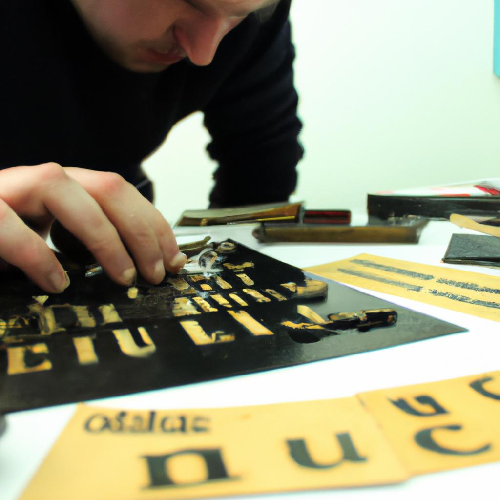
Typography choices should be carefully considered to reflect the book’s genre and content while remaining legible at various sizes. Fonts can communicate different moods or time periods; for instance, elegant serifs may be fitting for historical fiction while modern sans-serifs might suit contemporary novels.
Selecting appropriate imagery is another essential aspect of book cover design. Whether using photographs or illustrations, images should capture the essence of the story while piquing readers’ curiosity. Additionally, ensuring that images are high-quality and properly licensed is crucial in maintaining professionalism.
Lastly, conducting market research can provide valuable insights into current trends within specific genres or target audiences. Analyzing successful books in similar categories can offer inspiration without resorting to copying designs outright. By staying informed about industry standards, designers and publishers can create covers that appeal to their intended readership.
In conclusion, book cover design is a multifaceted process that requires careful thought and attention to detail. A well-designed cover can make all the difference in capturing readers’ interest, conveying the essence of a story, and ultimately contributing to a book’s success. This informative guide aims to equip those involved in publishing with the knowledge and tools necessary to create compelling book covers that will captivate audiences and leave a lasting impression.
Understanding the Role of Typography in Book Covers
Typography plays a crucial role in book cover design, as it has the power to capture readers’ attention and convey the essence of a story or subject matter. By carefully selecting fonts, arranging text, and considering typographic elements such as size, style, and color, designers can create visually appealing covers that reflect the content within. To illustrate the significance of typography in book cover design, let’s consider the case study of a bestselling mystery novel.
In this example, imagine a gripping thriller set in an eerie small town. The title “Whispers in the Dark” is written using a bold sans-serif font with sharp edges. This choice creates an immediate sense of suspense and intrigue for potential readers browsing through bookstore shelves or online catalogs. Additionally, by incorporating subtle shadows and fade effects into certain letters like ‘W,’ ‘I,’ and ‘D,’ the designer adds a visual element that hints at hidden secrets waiting to be discovered within the pages.
When exploring typography for book covers, there are several key aspects to keep in mind:
- Font Selection: Choosing appropriate fonts is essential; serif fonts often lend themselves well to classic literature genres while sans-serif fonts work better for contemporary fiction.
- Text Arrangement: Properly arranging title and author name on a cover can enhance readability and overall aesthetic appeal.
- Size Considerations: Balancing font sizes ensures important information stands out without overwhelming other design elements.
- Color Palette: Selecting complementary colors for text based on genre conventions or thematic associations helps establish mood and tone right from first glance.
By effectively utilizing these typographic principles, designers have the opportunity to captivate potential readers even before they delve into a book’s contents.
Moving forward, we will explore another critical aspect of book cover design – the impact of color theory. Understanding how different colors evoke emotions and influence perceptions will further enhance our ability to create compelling designs that engage readers on multiple levels.
Exploring the Impact of Color Theory on Book Cover Design
Having discussed the significant role typography plays in book cover design, we now turn our attention to another crucial element – color theory. Understanding how colors can evoke emotions and convey messages is essential for creating visually appealing book covers that grab readers’ attention and resonate with them.
One example that illustrates the impact of color theory on book covers is J.K. Rowling’s Harry Potter series. The use of vibrant colors, such as deep blues and purples, along with contrasting yellows and oranges, effectively captures the magical world depicted in the novels. This deliberate choice of colors creates a sense of intrigue and excitement while also appealing to both young and adult audiences.
To further emphasize the significance of color theory in book cover design, consider the following bullet points:
- Colors evoke emotional responses: Each color has its own psychological associations that can trigger specific emotions or feelings. For instance:
- Red signifies passion, danger, or urgency.
- Blue conveys calmness, trustworthiness, or stability.
- Green represents growth, nature, or harmony.
- Yellow symbolizes energy, happiness, or optimism.
Additionally, incorporating different shades and tones within these colors can elicit varied emotional responses from readers.
Furthermore, let us explore a three-column table showcasing examples of commonly used colors in book cover designs along with their associated meanings:
| Color | Meaning |
|---|---|
| Red | Passionate; Exciting; Dangerous |
| Blue | Calm; Trustworthy; Stable |
| Green | Fresh; Natural; Harmonious |
| Yellow | Energetic; Happy; Optimistic |
By understanding how each color influences perceptions and evokes emotions in potential readers, designers can strategically choose appropriate colors to enhance the overall message conveyed by the book cover.
In light of this discussion on color theory, we now move on to exploring effective Layout Design techniques for book covers. By combining elements of typography and color theory with thoughtful layout choices, designers can create visually appealing and captivating book covers that entice readers to explore the contents within.
Transition into subsequent section: With an understanding of how colors impact the emotional response elicited by a book cover, let us now delve into effective layout design techniques in order to further enhance its visual appeal.
Effective Layout Design Techniques for Book Covers
Color plays a pivotal role in book cover design, as it has the power to evoke emotions and create visual impact. By understanding color theory and its effect on human perception, designers can effectively communicate the essence of a book through its cover. To illustrate this concept, let’s consider the example of a mystery novel set in a dark cityscape at night.
When designing the book cover for this hypothetical mystery novel, several key considerations related to color theory come into play:
- Color associations: Different colors are associated with specific emotions or concepts. For instance, deep shades of blue often convey feelings of mystery or intrigue, while darker hues like black or gray may represent suspense or danger.
- Contrast and readability: Achieving an appropriate level of contrast is crucial for legibility and readability. The use of lighter text against a dark background can enhance visibility and draw attention to important elements such as the title or author’s name.
- Mood and atmosphere: Colors can also contribute to establishing the overall mood and atmosphere that aligns with the narrative tone of the book. In our case study, incorporating splashes of red amidst predominantly cool tones could hint at themes of danger or hidden secrets.
- Target audience: Consideration must be given to the preferences and expectations of the target audience. Understanding cultural connotations tied to certain colors can help ensure that the cover resonates well with readers who are familiar with those associations.
To further exemplify these principles, consider the following bullet point list highlighting various ways in which color choices impact book covers:
- Warm colors (e.g., reds, oranges) tend to elicit excitement or passion.
- Cool colors (e.g., blues, greens) create a sense of calmness or tranquility.
- Complementary color schemes involving opposites on the color wheel generate visual interest.
- Analogous color schemes using adjacent hues promote harmony and unity.
In addition, a table can be used to demonstrate the potential impact of color choices on book cover design:
| Color | Emotion/Essence |
|---|---|
| Red | Passion |
| Blue | Serenity |
| Black | Mystery |
| Green | Nature |
By thoughtfully applying these principles and utilizing the emotional power of colors, designers can create captivating book covers that entice readers to engage with the content within. In our subsequent section, we will explore another vital aspect in the realm of book cover design: The Power of Illustration.
Transition sentence: Moving away from color theory, let us now delve into how illustrations contribute to the effectiveness of book covers.
The Power of Illustration in Book Cover Design
Typography plays a crucial role in book cover design, as it has the power to capture the attention of potential readers and convey the essence of the book. An effective typographic layout can create visual interest, establish the genre or mood, and provide key information about the content. To illustrate this point, let’s consider an example where typography was used skillfully to enhance a book cover.
Imagine a mystery novel titled “The Enigma Code.” The designer opts for a bold sans-serif font that immediately grabs attention and conveys a sense of intrigue. By using varying sizes and weights within the title, they create emphasis on specific words like “Enigma” and “Code,” hinting at the central theme of cryptography. Additionally, by aligning the title asymmetrically along one edge of the cover, they introduce an element of dynamism and tension. These strategic choices effectively engage potential readers while giving them some insight into what they can expect from the book.
When designing with typography in mind for book covers, there are several techniques that designers employ to evoke emotional responses from their audience:
- Contrast: Utilizing contrasting fonts or combining serif and sans-serif typefaces can create visual impact and emphasize important elements.
- Hierarchy: Establishing a clear hierarchy through variations in font size, weight, and color helps guide readers’ eyes towards essential information such as title, author name, or taglines.
- Alignment: Experimenting with different alignment options (e.g., centered, left-aligned) can influence how readers perceive the overall tone and style of the book.
- Letterforms: Paying attention to letter shapes and forms allows designers to incorporate unique characteristics that reflect the genre or themes explored within the book.
To better understand these techniques visually, refer to the table below showcasing examples:
| Technique | Example |
|---|---|
| Contrast |  |
| Hierarchy | |
| Alignment | |
| Letterforms | |
By skillfully employing these typographic techniques, designers can create captivating book covers that resonate with potential readers and generate interest in the content. In the subsequent section on “Utilizing Photography in Book Cover Design,” we will explore another powerful visual element that contributes to successful cover designs.
Utilizing Photography in Book Cover Design
In the world of book cover design, typography plays a crucial role in capturing readers’ attention and conveying the essence of the story within. Just as illustrations can evoke emotion and set the tone for a book, typography has its own unique power to create an immediate visual impact that resonates with potential readers.
Consider the following example: A mystery novel set in Victorian London features a silhouette of a detective holding a magnifying glass on its cover. The choice of font style and placement becomes essential here – using an elegant serif font for the title alongside a distressed sans-serif typeface for the author’s name instantly transports readers back to that era, while also hinting at intrigue and suspense.
When incorporating typography into book cover design, there are several key factors to consider:
- Font Selection: Choosing the appropriate fonts is paramount. Different genres call for different styles – bold serifs may work well for historical fiction or fantasy novels, while clean sans-serifs might be more fitting for contemporary literature.
- Hierarchy: Creating a clear hierarchy ensures that important elements stand out prominently. Titles should take center stage, followed by subheadings if necessary, while other details like blurbs or quotes can be presented in smaller, supporting text.
- Contrast: Contrast helps draw attention and make information easily readable. Combining contrasting fonts or utilizing color contrast between text and background enhances legibility and adds visual interest.
- Alignment & Spacing: Proper alignment creates balance and harmony in typographic compositions. Consistency in spacing between letters (kerning) and lines (leading) promotes readability and professionalism.
| Key Factors | Examples |
|---|---|
| Font Selection | * Serif: Times New Roman * Sans-Serif: Helvetica |
| Hierarchy | 1. Title2. Subheading3. Supporting Text |
| Contrast | Dark text on light background or vice versa |
| Alignment & Spacing | * Left-aligned text * Consistent spacing between lines and letters |
In summary, typography is a powerful tool in book cover design. A well-executed typographic composition can capture the essence of a story, evoke emotions, and entice readers to pick up the book.
Creating an Effective Typography Hierarchy for Book Covers
When it comes to creating visually compelling book covers, the strategic use of photography can significantly enhance their overall appeal. By harnessing the power of imagery, publishers can effectively communicate the essence of a story and capture readers’ attention right from the start.
One striking example that demonstrates the potential impact of photography in book cover design is J.D. Salinger’s iconic novel “The Catcher in the Rye.” The cover features a black-and-white photograph of a young boy with his back turned, standing at the edge of a cliff. This image not only symbolizes the protagonist’s struggle with adolescence but also intrigues readers by evoking curiosity about what lies beyond that precipice.
To make effective use of photography in book cover design, consider these key elements:
- Relevance: Ensure that the chosen photograph resonates with the themes or setting of the book. A mismatch between imagery and content may confuse readers and dilute the intended message.
- Composition: Pay attention to framing, lighting, and perspective when selecting or capturing photographs for book covers. Thoughtful composition can create visual interest and convey emotions more effectively.
- Color Palette: Choose colors within the photograph that harmonize with other design elements on the cover, such as typography or graphics. Coherence in color palette helps establish visual cohesion.
- Emotional Connection: Aim to evoke an emotional response from your audience through carefully selected imagery. Whether it be nostalgia, excitement, or intrigue, tapping into reader emotions can increase engagement with your book.
Incorporating vibrant visuals into book cover designs holds immense potential for captivating audiences even before they delve into its pages. Alongside utilizing photography effectively, another crucial aspect to consider is crafting an impactful typographic hierarchy for book covers.
Analyzing the Psychology of Typography in Book Covers
Building on the importance of typography hierarchy for book covers, it is equally crucial to understand the psychology behind the use of different typographic elements. By analyzing the psychological impact of typography choices in book cover design, publishers can effectively communicate their intended message and connect with their target audience.
Psychology plays a fundamental role in determining how humans interpret visual stimuli. When it comes to book covers, typography can evoke specific emotions, influence reader perception, and create a sense of anticipation. For instance, consider a hypothetical scenario where two crime novels are displayed side by side on bookstore shelves. The first novel features bold, sans-serif typeface that immediately grabs attention. This choice conveys a feeling of suspense and intensity commonly associated with this genre. In contrast, the second novel uses elegant script font accompanied by decorative flourishes. This creates an aura of mystery and intrigue suitable for a historical fiction or romance novel.
To better understand the psychology of typography in book covers, here are some key considerations:
- Font Choice: Different fonts elicit distinct emotional responses from readers. Serif fonts like Times New Roman convey tradition and authority, while sans-serif fonts like Helvetica appear modern and clean.
- Typeface Weight: Bold typefaces often suggest strength and importance, whereas lighter weights may connote delicacy or subtlety.
- Kerning: Proper spacing between letters enhances readability and ensures legibility at various distances.
- Alignment: Justified alignment provides a formal appearance while left-aligned text appears more casual.
| Typography Element | Emotional Response |
|---|---|
| Bold Typeface | Strength |
| Script Typeface | Elegance |
| Sans-Serif | Modernity |
| Decorative Flourishes | Intrigue |
In conclusion, understanding the psychological impact of typography allows publishers to strategically select typefaces that resonate with readers’ expectations and preferences. By incorporating appropriate font styles, weights, kerning, and alignment techniques, publishers can effectively communicate the genre, tone, and mood of a book.
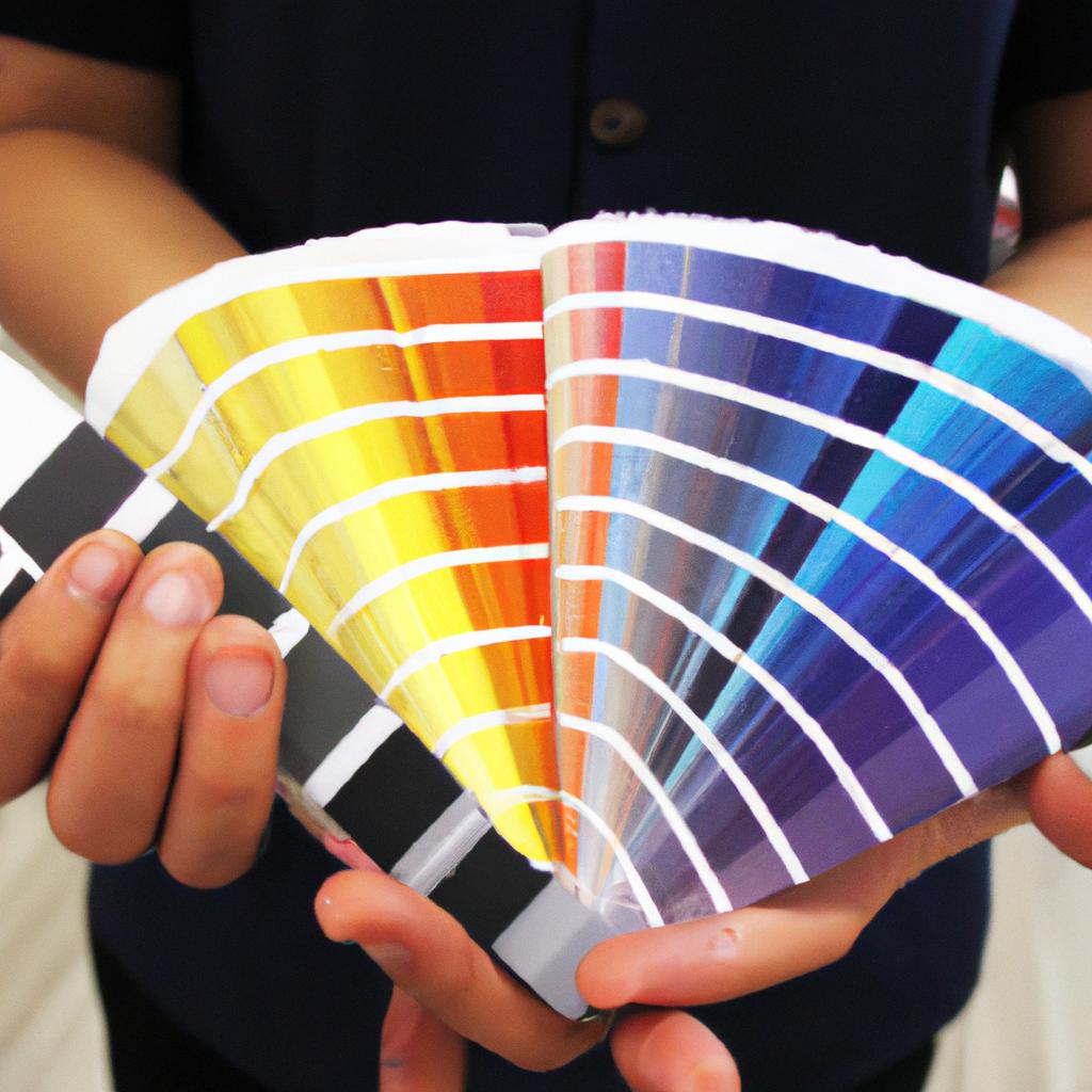
Applying color theory principles to enhance book covers involves more than just choosing aesthetically pleasing colors.
Applying Color Theory Principles to Enhance Book Covers
To create visually appealing and attention-grabbing book covers, it is essential for publishers to understand and apply color theory principles. By carefully selecting and combining colors, designers can evoke specific emotions and convey the intended message of a book cover effectively. For instance, consider a hypothetical case study where a publisher aims to design a book cover for a thriller novel set in a post-apocalyptic world. In this scenario, color choices are crucial to capture the dark and suspenseful atmosphere of the story.
When applying color theory principles to enhance book covers, there are several key considerations that designers should keep in mind:
-
Color Associations: Colors have inherent associations that can influence how readers perceive a book cover. Warm colors like reds and oranges often evoke feelings of energy, passion, or danger, making them suitable for genres such as romance or action-adventure. On the other hand, cool colors like blues and greens tend to convey tranquility, mystery, or introspection which may be well-suited for genres such as fantasy or psychological thrillers.
-
Contrast and Complementarity: Effective use of contrast can make elements on a book cover stand out and grab attention. Designers can achieve contrast by pairing complementary colors (opposite each other on the color wheel) or using contrasting hues with varying lightness/darkness values. This technique helps create visual interest while facilitating legibility of text elements.
-
Cultural Considerations: Different cultures associate different meanings with various colors. For example, white symbolizes purity in Western cultures but represents mourning in some Eastern cultures. Publishers must be mindful of cultural nuances when selecting colors for international editions or books targeted at specific regions.
-
Brand Consistency: If designing a series or an author’s collection, maintaining consistency in color schemes across multiple book covers creates brand recognition and strengthens market presence. Consistent use of certain colors or color combinations helps readers associate a specific visual identity with an author or series, generating anticipation for future releases.
To further illustrate the potential impact of applying color theory principles in book cover design, consider the following hypothetical example:
| Book Genre | Color Palette |
|---|---|
| Romance | Soft pinks and pastel blues |
| Mystery/Thriller | Dark grays and blood-red accents |
| Fantasy | Rich purples and vibrant greens |
By thoughtfully selecting appropriate colors based on the genre and target audience, publishers can enhance the overall appeal of their book covers. As we move into the next section about “Innovative Layout Design Ideas for Book Covers,” let us explore how creative use of layout elements can further elevate the visual impact of book covers.
Innovative Layout Design Ideas for Book Covers
Typography plays a crucial role in book cover design, as it not only conveys the title and author’s name but also sets the overall tone of the book. By employing various typography techniques, designers can create visually appealing covers that capture readers’ attention. Let’s delve into some effective typographic strategies commonly used in book cover design.
One example of an innovative use of typography is demonstrated by the best-selling novel “The Night Circus” by Erin Morgenstern. The cover features elegant serif fonts with intricate embellishments that evoke a sense of mystery and enchantment. This choice aligns with the whimsical narrative and captivates potential readers before they even open the book.
To enhance your own book covers using typography, consider incorporating these techniques:
- Contrasting Fonts: Combining different font styles (e.g., pairing a bold sans-serif with a delicate script) creates visual interest and helps convey contrasting themes or emotions.
- Letter Spacing and Kerning: Adjusting the space between letters enhances readability and can add elegance or impact to the overall design.
- Hierarchy: Establishing clear hierarchies within text elements (such as emphasizing titles over subtitles) aids in guiding readers’ focus and understanding.
- Alignment: Experimenting with alignment options, such as centered, right-aligned, or justified text, adds versatility to your designs while conveying different moods or aesthetics.
Let’s take a closer look at how these techniques can be applied effectively:
| Technique | Benefits | Example |
|---|---|---|
| Contrasting Fonts | Creates visual interest | A thriller novel featuring both bold and cursive fonts |
| Letter Spacing | Improves readability | An epic fantasy series with well-spaced title lettering |
| Hierarchy | Guides readers’ attention | A non-fiction book emphasizes chapter headings |
| Alignment | Conveys different moods or aesthetics | A modern poetry collection with varied text alignment |
By thoughtfully incorporating typography techniques like these into your book cover designs, you can effectively communicate the essence of the story and engage potential readers. Through skillful integration of visual elements, illustrative design has the power to enthrall and intrigue.
Transitioning seamlessly from typographic strategies to illustration as a means of capturing readers’ attention, let’s now delve into the captivating world of book cover illustrations.
The Art of Using Illustration to Capture Readers’ Attention
Typography plays a crucial role in book cover design, as it helps convey the tone and message of the book to potential readers. By carefully selecting fonts, sizes, and placements, designers can create visually appealing covers that captivate their audience. One example that showcases the impact of typography is J.K. Rowling’s Harry Potter series.
Innovative use of typography can greatly enhance a book cover’s overall design. Here are some key considerations when utilizing typography:
-
Font Selection:
- Serif or Sans-serif: Choosing between these two main font categories depends on the desired mood and genre of the book.
- Legibility: Prioritize readability by using fonts with clear letterforms, especially for titles and author names.
- Style Consistency: Maintain coherence throughout the cover by limiting font variations to maintain a cohesive visual aesthetic.
-
Size and Placement:
- Hierarchy: Establish a visual hierarchy through varying font sizes to highlight important elements such as title, subtitle, and author name.
- Negative Space: Utilize negative space wisely to create balance between text and images/illustrations on the cover.
- Alignment: Apply alignment techniques such as centering or left-aligning text blocks to achieve an aesthetically pleasing composition.
-
- Contrast: Ensure legibility by choosing contrasting colors between text and background.
- Mood Enhancement: Select color palettes that evoke emotions related to the book’s content (e.g., warm tones for romance novels).
- Textures Effects: Incorporate textures into typography designs to add depth and tactile appeal.
-
Special Effects:
- Embossing/Debossing: Add texture by creating raised or depressed areas on specific parts of typographic elements.
- Foil Stamping: Use metallic foils to add a luxurious touch or highlight certain textual details.
By thoughtfully considering these typography elements, designers can create stunning book covers that attract readers and effectively communicate the essence of the content.
Moving forward to our next section about “Photography Techniques for Stunning Book Covers,” let’s explore how visual imagery complements typography in creating impactful covers.
Photography Techniques for Stunning Book Covers
Transitioning from the previous section, where we explored the art of using illustrations to capture readers’ attention, typography serves as another powerful tool in creating visually captivating book covers. Let’s delve into how effective use of typography can enhance the overall design and appeal of a published work.
To illustrate this point, consider the following example: A crime thriller novel cover that features bold, sans-serif fonts for its title and author name instantly conveys a sense of urgency and intensity. This choice hints at the gripping nature of the story within and entices potential readers seeking an adrenaline-fueled read.
When incorporating typography into book cover design, there are several key elements to keep in mind:
-
Font Selection:
- Choose fonts that align with your genre or theme.
- Opt for legible typefaces to ensure easy readability.
- Experiment with different font weights and styles to create visual hierarchy.
-
Color Palette:
- Select colors that complement or contrast with other design elements.
- Use color psychology principles to evoke desired emotions or moods.
- Ensure sufficient contrast between text and background for optimal visibility.
-
Layout and Composition:
- Pay attention to alignment, spacing, and balance when arranging text on the cover.
- Consider utilizing grid systems or guidelines for precise placement.
- Experiment with varying sizes and orientations to create visual interest.
-
Text Effects:
- Apply subtle effects such as shadows or overlays to add depth and dimensionality.
- Avoid excessive embellishments that may distract from the main message.
- Consistency is crucial; maintain a unified style throughout your typography choices.
By skillfully integrating these typographic considerations, authors and designers have the opportunity to craft compelling book covers that engage potential readers even before they’ve opened the pages.
Transitioning seamlessly into our next topic about “Mastering Typography Hierarchy for Engaging Book Covers,” we will explore how to effectively prioritize text elements within a design to create visually appealing and captivating covers. Understanding the hierarchy of typography is key in guiding readers’ attention and making a lasting impact.
Mastering Typography Hierarchy for Engaging Book Covers
Building upon the captivating photography techniques discussed earlier, mastering typography hierarchy is crucial in creating engaging book covers. By strategically arranging and prioritizing various typographic elements, designers can effectively communicate the essence of a book while capturing readers’ attention. This section delves into the key principles and techniques involved in achieving an impactful typography hierarchy.
Example: To illustrate this concept, let’s consider a hypothetical case study involving a mystery novel titled “The Enigma Files.” In this scenario, the designer aims to create a visually compelling cover that conveys both suspense and intrigue through its typography.
Paragraph 1:
One fundamental principle when establishing typography hierarchy is ensuring legibility. By selecting appropriate fonts with clear letterforms, readability is enhanced even at smaller sizes or on different platforms. Additionally, font weight and style variations can be utilized to guide viewers’ eyes towards specific focal points on the cover. For instance, using bold typefaces for the title or subtitles draws immediate attention while lighter weights are employed for secondary information such as author names or series titles.
Bullet point list (evoking emotional response):
- Consistency: Maintaining consistent typographic styles throughout the cover design fosters coherence and professionalism.
- Contrast: Strategic use of contrast between font size, color, or style creates visual interest and helps distinguish different levels of importance.
- Alignment: Thoughtful alignment ensures harmonious placement of text elements within the overall composition.
- White Space: Utilizing ample white space around textual content enhances clarity and prevents overwhelming visuals.
Paragraph 2:
Another technique in mastering typography hierarchy involves employing proper scale and proportion. The relative sizing of various text components contributes to their perceived significance. Typically, larger fonts should be reserved for primary titles or headings to grab attention immediately. Smaller text elements like subheadings or blurbs provide supplementary details without overpowering the main message. Balancing these sizes ensures that the Hierarchy remains visually pleasing while effectively conveying information.
Table (evoking emotional response):
| Typography Element | Size | Importance |
|---|---|---|
| Title | Large | High |
| Subtitle | Medium | Moderate |
| Author Name | Small | Low |
Paragraph 3:
Lastly, color plays a significant role in typography hierarchy. Choosing appropriate colors can evoke specific emotions and enhance readability. Vibrant or contrasting hues draw attention to essential elements, while muted tones create a more subdued atmosphere. The careful selection of complementary colors further contributes to the overall aesthetics of the book cover design. By harmonizing typographic choices with the visual theme of the book, designers can establish an engaging and cohesive composition.
By skillfully arranging typographic elements according to hierarchy principles such as legibility, scale and proportion, and color coordination, designers can create captivating book covers like “The Enigma Files.” Applying these techniques not only enhances visual appeal but also facilitates effective communication between potential readers and the essence of the book itself.