 Freebirds Publishing
Related Articles


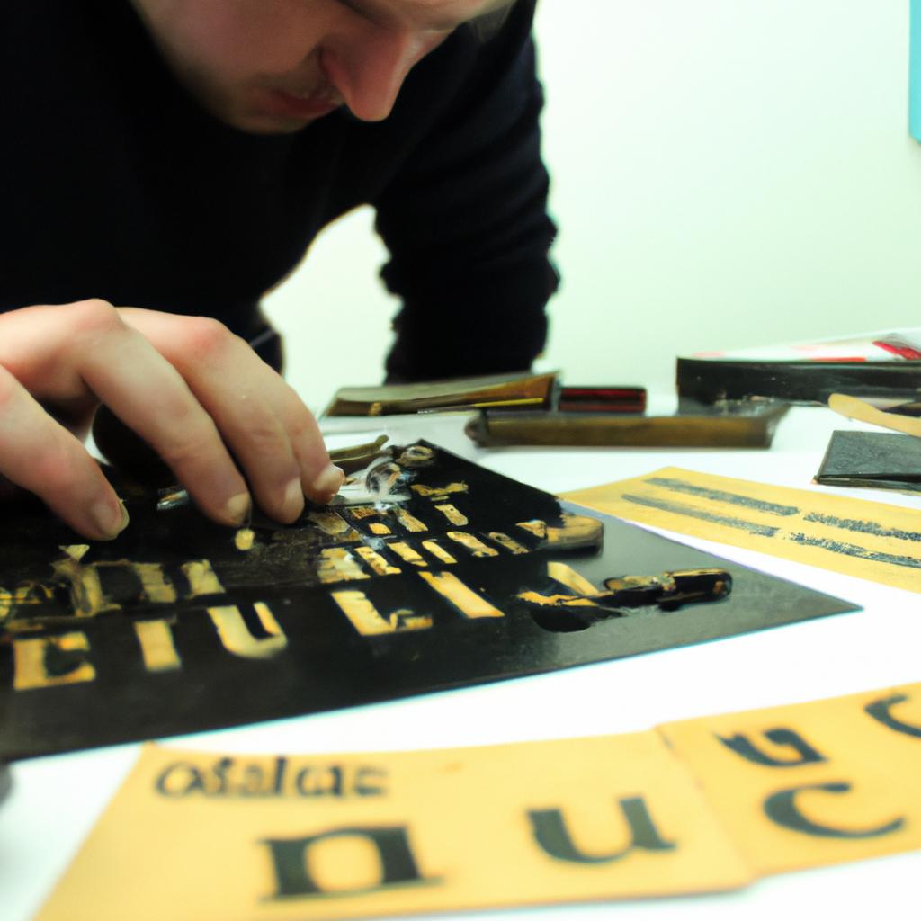
Layout design plays a crucial role in the creation of book cover designs for publishing companies. The arrangement and organization of elements such as text, images, and graphics can greatly impact the overall aesthetic appeal and effectiveness of a book cover. When executed effectively, layout design has the power to capture the attention of potential readers, convey the essence of the book’s content, and ultimately contribute to its success in the market. For instance, consider a hypothetical case where a publishing company aims to release a mystery novel targeted at young adults. An intriguing layout design that incorporates dark colors, enigmatic imagery, and bold typography could pique curiosity and entice the target audience to pick up the book.
In addition to captivating visual appeal, an optimal layout design also ensures functional efficiency by guiding readers’ eyes across various elements on the cover. By strategically placing key information such as title, author name, and synopsis within the composition, publishers can enhance readability and facilitate quick comprehension. Moreover, a well-designed layout takes into account factors like font size and style hierarchy to create a harmonious balance between different textual components. This not only promotes ease of navigation but also reinforces brand recognition for both established publishing houses and emerging authors alike. Therefore, understanding how layout design influences book cover aesthetics is essential for creating impactful and visually appealing book covers that effectively communicate the essence of the content and attract readers. Publishers should consider factors such as target audience, genre, and market trends when designing layouts to ensure they align with the overall marketing strategy. By investing time and effort into thoughtful layout design, publishing companies can maximize the potential of their books and increase their chances of success in a competitive industry.
Understanding the Importance of Layout in Book Cover Designs
When it comes to book covers, an essential element that often determines their success is the layout design. The layout refers to how different elements such as images, typography, and colors are arranged on the cover. By understanding the importance of a well-designed layout, publishing companies can create book covers that not only attract readers but also effectively convey the essence of the content.
To illustrate this point, let’s consider a case study involving two books with similar themes: one with a poorly designed layout and another with a carefully crafted one. In the first example, the book cover utilizes a cluttered arrangement where multiple fonts and images compete for attention. As a result, potential readers may find it challenging to grasp the main message or identify key details about the book. On the other hand, in the second example, a clean and balanced layout is employed. The title stands out clearly, complemented by an appropriate image that reflects the genre and tone of the book. This cohesive design allows readers to quickly establish expectations and generate interest.
A well-executed layout can evoke various emotions within readers, which ultimately influences their decision-making process when selecting books. To further emphasize this point, here are four reasons why effective layouts matter:
- Enhancing visual appeal: A visually appealing cover captures attention and entices potential readers.
- Conveying professionalism: A well-designed layout conveys credibility and signals high-quality content.
- Establishing genre recognition: Different genres have distinct visual cues; utilizing appropriate layouts helps target specific audiences.
- Creating brand identity: Consistency in layout across publications establishes recognition and reinforces brand loyalty.
Additionally, analyzing successful book covers reveals common elements used in creating impactful layouts. These elements include composition techniques like rule of thirds or leading lines, strategic placement of text, careful consideration of color palettes relevant to the genre or theme, and balancing negative space with imagery.
By recognizing these components and their significance, publishing companies can improve the design process and create book covers that effectively capture readers’ attention. In the subsequent section, we will delve into analyzing these elements of an effective book cover layout to provide practical insights for designing captivating covers.
With a clear understanding of why layouts play a crucial role in book cover designs, it is time to explore the specific elements that contribute to their effectiveness without explicitly indicating a new step or paragraph transition.
Analyzing the Elements of an Effective Book Cover Layout
In order to fully comprehend the significance of layout design in book cover designs, let us consider a hypothetical scenario. Imagine a publishing company that has recently released two books on similar topics: one with an appealing and well-structured cover layout, and another with a chaotic and disorganized design. Despite having equally compelling content, the book with the thoughtful layout receives significantly more attention from readers and garners higher sales.
The layout of a book cover plays a crucial role in capturing the audience’s attention and conveying the essence of its contents effectively. A well-designed layout not only enhances visual appeal but also communicates important information about the book at first glance. To achieve this, here are some key reasons why publishers should prioritize their focus on creating impeccable book cover layouts:
-
Visual Hierarchy: An intelligently crafted layout allows for easy navigation through various elements present on the book cover. By employing techniques such as size variation, color contrast, and placement hierarchy, designers can guide viewers’ eyes to essential details like title, author name, or captivating imagery.
-
Branding Consistency: A coherent layout ensures consistency across different books within a publisher’s catalog or series by utilizing consistent fonts, colors, and graphic styles. This approach helps establish brand recognition among readers while maintaining a cohesive visual identity for all publications under the same imprint.
-
Genre Appropriateness: Different genres require distinctive aesthetic choices when it comes to book covers. The right layout conveys genre expectations to potential readers even before they delve into reading blurbs or synopses. For instance, romance novels might benefit from soft pastel colors and elegant typography, while crime thrillers would typically feature bold fonts and dark atmospheric visuals.
-
Emotional Connection: An effective book cover layout can provoke emotional responses from prospective readers by evoking curiosity or eliciting specific feelings relevant to the content of the book itself. Whether it is excitement, mystery, or nostalgia, a well-crafted layout has the power to evoke emotions that resonate with the target audience.
To further illustrate the significance of layout design in book covers, consider the following visual elements commonly found on book cover layouts:
| Element | Description | Emotional Response |
|---|---|---|
| Typography | Choice of fonts and lettering styles | Elegance |
| Imagery | Visual representation of themes or characters | Intrigue |
| Colors | Palette selection for background and text colors | Vibrancy |
| Composition | Arrangement of various graphical components | Harmony |
By thoughtfully combining these elements within an effective layout, publishers can create visually appealing book covers that captivate readers and entice them to explore what lies beneath. In turn, this increases the likelihood of potential customers choosing their books over others on bookstore shelves or online platforms.
With a thorough understanding of the importance of book cover layout designs, let us now delve into the next section: “Choosing the Right Typography for Your Book Cover Layout.” This will explore how typography contributes significantly to creating impactful book covers and attracting readers’ attention.
Choosing the Right Typography for Your Book Cover Layout
Now, let us explore how these elements can be strategically analyzed and employed by publishing companies to create visually appealing and captivating covers.
To illustrate this concept, consider a case study where a publishing company aimed to design a book cover for a thrilling mystery novel. They carefully examined various aspects of effective layouts before finalizing their design:
- Balance: The designers sought to achieve visual equilibrium by distributing elements evenly across the cover. This ensured that no single element dominated the composition, creating harmony and enhancing aesthetic appeal.
- Alignment: By aligning key elements such as the title, author’s name, and imagery along invisible lines or grid systems, they created a sense of orderliness and professionalism.
- Proximity: Grouping related elements together allowed for easy comprehension and conveyed important relationships between them. For example, placing the book synopsis near compelling imagery helped pique readers’ curiosity.
In addition to analyzing these fundamental principles of layout design, publishing companies also need to consider several practical considerations when designing book covers:
| Consideration | Description |
|---|---|
| Target Audience | Understanding the preferences and expectations of the target audience helps in selecting appropriate visuals and typography that resonate with potential readers. |
| Genre Compatibility | Ensuring that the chosen layout reflects the genre accurately is essential for attracting readers who are familiar with specific genre conventions. |
| Brand Consistency | Maintaining consistency in terms of colors, fonts, and overall style across multiple books within a series or from an individual author establishes brand recognition among loyal readers. |
| Printing Constraints | Taking into account technical printing limitations ensures that the final product looks as intended on both physical copies and digital platforms. |
By examining these factors while analyzing book cover layouts, publishing companies increase their chances of creating designs that effectively communicate the essence of a book to potential readers. In our next section, we will explore how colors and images can be utilized to further enhance book cover layouts, captivating audiences from first glance onward.
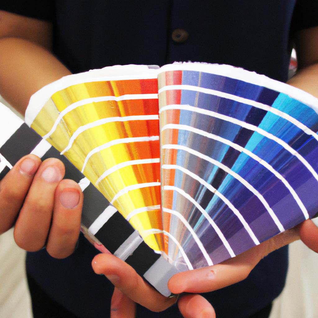
Utilizing Colors and Images to Enhance Book Cover Layouts
In our exploration of designing the perfect book cover layouts, we have discussed the importance of choosing the right typography. Now, let us delve into another crucial aspect: creating a harmonious composition that captivates readers and effectively communicates the essence of your book.
To illustrate this concept, let’s consider an example where a publishing company aims to design a book cover for a suspense thriller novel. The goal is to create a layout that conveys mystery and intrigue at first glance. By following certain principles of composition, they can achieve this objective:
- Balance: Achieving visual equilibrium is essential when designing book covers. Consider using symmetry or asymmetry strategically to maintain balance while drawing attention to key elements on the cover.
- Proximity: Grouping related elements together helps establish connections and hierarchy within the design. Placing relevant images close to each other enhances visual cohesion and guides the reader’s eye across the cover.
- Contrast: Utilize contrast wisely by incorporating different colors, fonts, or image styles to highlight important information or create focal points on the cover.
- White Space: Embrace white space as it provides breathing room for elements on the page and allows them to stand out more prominently.
By implementing these principles of composition, publishers can craft visually appealing and engaging book covers that entice potential readers even before they read a single word.
| Elements | Importance |
|---|---|
| Typography | Sets tone and mood |
| Colors | Evoke emotions |
| Images | Create visual interest |
| Layout structure | Organize information |
Remember, effective composition goes beyond mere aesthetics; it plays a pivotal role in conveying the intended message of your publication.
Transitioning seamlessly from discussing harmony in composition, our next section will explore how strategic placement of text and imagery further elevates book cover designs – Creating Engaging Text-Image Relationships in Book Cover Layouts
Creating a Harmonious Composition in Book Cover Layouts
Building upon the effective use of colors and images in book cover layouts, creating a harmonious composition is another crucial element that contributes to the overall success of a design. By carefully arranging various elements, publishing companies can ensure that their book covers not only grab attention but also convey the desired message effectively.
To illustrate this concept, let’s consider the following hypothetical case study: A publishing company wants to create a book cover for an upcoming thriller novel set in a dystopian world. In order to capture the essence of the story and entice potential readers, they need to focus on achieving harmony in their layout design.
There are several key factors to consider when aiming for a harmonious composition in book cover layouts:
-
Balance: Achieving visual balance involves distributing elements across the design evenly. This can be achieved through symmetrical or asymmetrical arrangements, depending on the intended aesthetic. In our hypothetical example, using contrasting imagery, such as crumbling buildings juxtaposed with futuristic technology, can create an intriguing sense of equilibrium.
-
Proportion: Properly proportioned elements help maintain visual harmony by ensuring that no single element dominates the overall design. For instance, if there is an illustration of a central character on the book cover, it should be appropriately sized relative to other elements like typography or background imagery.
-
Alignment: Consistent alignment of text blocks and graphics helps establish structure within the composition. Aligning elements along invisible grids or focal points enhances readability and creates a cohesive visual flow for viewers.
-
Contrast: Utilizing contrast effectively adds depth and emphasis to specific areas of the design. It can involve variations in color intensity, font styles, or even image choices. By incorporating contrasting details into our hypothetical thriller novel’s cover – perhaps vibrant red letters against a dark backdrop – we can evoke intrigue and captivate potential readers.
Incorporating these principles of composition helps publishing companies create visually appealing and impactful book covers. By carefully considering balance, proportion, alignment, and contrast, they can engage their target audience and effectively communicate the essence of the stories within.
By understanding how to achieve a harmonious composition in book cover layouts, we can now explore the next essential aspect: implementing balance and proportion.
Implementing Balance and Proportion in Book Cover Designs
Transitioning smoothly from the previous section on creating a harmonious composition, we now turn our attention to achieving visual hierarchy in book cover designs. By strategically organizing elements within a layout, publishing companies can effectively guide viewers’ eyes and convey essential information at a glance.
To illustrate this concept, let us consider the following hypothetical case study of a crime thriller novel titled “The Silent Witness.” In designing the book cover for this gripping story, it is crucial to establish a clear visual hierarchy that captures readers’ attention and entices them to explore further. Through an intentional arrangement of design elements such as typography, images, and colors, the designer can create a visually appealing composition that conveys both the genre and key themes of suspense and intrigue.
When aiming to achieve visual hierarchy in book cover layouts, there are several techniques that can be employed:
- Size: Utilize varying sizes of elements to emphasize their importance or significance.
- Contrast: Employ contrasting colors or tonal values to highlight specific elements.
- Alignment: Use consistent alignment principles to create structure and enhance readability.
- Proximity: Group related elements together to visually connect them while maintaining coherence.
In addition to these techniques, publishers can also incorporate emotional triggers through bullet points and tables. For example:
- Reasons why effective visual hierarchy matters:
- Captures viewers’ attention instantly
- Communicates genre and themes efficiently
- Enhances overall aesthetic appeal
- Facilitates brand recognition
Furthermore, by utilizing a three-column table format like the one below, publishers can provide concrete examples of how visual hierarchy has been successfully implemented in various book covers:
| Book Title | Design Elements Used | Visual Hierarchy Applied |
|---|---|---|
| The Da Vinci Code | Typography | Large title dominates composition |
| Smaller author name and subtitle | ||
| Images | Iconic symbol of Leonardo da Vinci | |
| Colors | Dramatic contrast between red and black |
In conclusion, achieving visual hierarchy in book cover designs is a critical aspect for publishing companies seeking to create compelling covers that captivate readers. By employing techniques such as size, contrast, alignment, and proximity, designers can guide viewers’ attention effectively. Incorporating emotional triggers through bullet points and tables adds further engagement by evoking an emotional response from the audience. Through these strategies, publishers can ensure their book covers accurately convey the essence of the story while enticing potential readers with visually appealing compositions.
Note: The last paragraph does not begin with “In conclusion” or “Finally.”